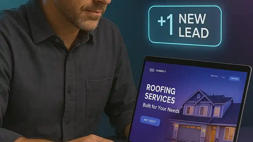
AI Voice Assistant
Answers calls instantly, books jobs, and sends confirmations 24/7.
- Natural voice & intent detection
- Live scheduling + SMS follow-up
- Missed-call text back
Smart business owners are using AI to capture leads, respond instantly, and book appointments automatically — all while they focus on what they do best.
(Disclosure: This page contains affiliate links and references to HighLevel. I may earn a commission at no additional cost to you.)


About Us
BUMS.AI builds conversion-ready SmartSites and AI voice/chat assistants that capture, qualify, and book leads automatically—so your business never sleeps. We combine UX, SEO, and automation with a human-sounding agent that answers in seconds, keeps conversations going, and drives appointments to your calendar. From branding and pages to CRM setup and review automations, we align the full customer journey to revenue—launch fast, iterate weekly, and scale with clarity.
Happy Customers
Proven Track Record
Support & Success


Free website + AI voice assistant that books jobs 24/7. Let BUMS.AI turn missed calls into confirmed appointments.


"We've been using BUMS.AI for over four years, and it's been a game-changer for our growth. The automations and AI inside the portal save our team hours every week. It keeps leads moving, follow-ups consistent, and everything organized — not just in roofing, but in how we run the business."
"I use the BUMS.AI team for all my landing pages and lead automation. They don't just build — they help me think through strategy, optimize every step, and make sure leads actually turn into customers. It's like having a full marketing and ops team without the overhead."

"BUMS.AI built my entire website and automation system for my IV clinic. It not only looks great — it works. I'm now ranking #1 on Google in my area, and they continue to update and support everything as we grow. It's like having a full marketing team behind the scenes."
"We've been using BUMS.AI for over four years, and it's been a game-changer for our growth. The automations and AI inside the portal save our team hours every week. It keeps leads moving, follow-ups consistent, and everything organized — not just in roofing, but in how we run the business."
"I use the BUMS.AI team for all my landing pages and lead automation. They don't just build — they help me think through strategy, optimize every step, and make sure leads actually turn into customers. It's like having a full marketing and ops team without the overhead."
"BUMS.AI built my entire website and automation system for my IV clinic. It not only looks great — it works. I'm now ranking #1 on Google in my area, and they continue to update and support everything as we grow. It's like having a full marketing team behind the scenes."

"I already had a website, but it wasn't doing much. BUMS.AI came in, optimized everything, connected my forms to real follow-up, and added the speed-to-lead automations I didn't even know I needed. Now my site works like a machine — leads come in, get followed up, and book themselves."

"BUMS.AI runs everything behind the scenes for my roofing company — websites, storm capture pages, automations, and more. When a storm hits, we're ready. The system follows up fast, routes the leads, and keeps everything tight. It's like having an in-house tech team focused on roofing."

"I started with just an idea and a few contacts. BUMS.AI helped me build everything — my consulting brand, my conference site, my automations, and my entire funnel. Now I run events with over 800 attendees, and it all flows through one system. It's professional, scalable, and exactly what I needed to grow fast."
"I already had a website, but it wasn't doing much. BUMS.AI came in, optimized everything, connected my forms to real follow-up, and added the speed-to-lead automations I didn't even know I needed. Now my site works like a machine — leads come in, get followed up, and book themselves."
"BUMS.AI runs everything behind the scenes for my roofing company — websites, storm capture pages, automations, and more. When a storm hits, we're ready. The system follows up fast, routes the leads, and keeps everything tight. It's like having an in-house tech team focused on roofing."
"I started with just an idea and a few contacts. BUMS.AI helped me build everything — my consulting brand, my conference site, my automations, and my entire funnel. Now I run events with over 800 attendees, and it all flows through one system. It's professional, scalable, and exactly what I needed to grow fast."
Bookings, transcripts & clean CRM data — keep your current site.
Perfect for small teams getting started with lead capture
Stop Missing LeadsIdeal for growing businesses ready to automate lead conversion
Convert More LeadsPerfect for businesses ready to scale and dominate their market
Outpace CompetitorsActionable Marketing Strategies from the BUMS.AI Blog


Author - Bums.ai Date:01/03/26

Author - Bums.ai Date:01/17/25

Author - Bums.ai Date:02/24/25

Empowering businesses with innovative solutions, we are committed to providing seamless support and fostering growth. Connect with us for a brighter, smarter future!
Tell us the best number and a good time to reach you. We’ll show you how BUMS.AI’s Voice Assistant answers instantly, qualifies callers, and books directly to your calendar—even after hours.
Copyright © BUMS.AI | Designed by BUMS.AI - Powered by BUMS.AI
Affiliate Disclaimer: We may earn commissions for recommending HighLevel and other products. This does not affect your price.